


Orbit Design System
Um Design System com dois níveis chamados Andromeda e Chamaleon para alimentar uma interface de Construtor de Páginas.
Design System • UX Design • UI Design • Gestão de Produto • Métodos Ágeis
Conteúdo 📖
1. Contexto
2. Meu papel
3. Primeiros passos
4. Inventário
5. Porque dois níveis?
6. Andromeda
7. Chamaleon
8. Próximos passos
9. Aprendizado
Contexto 💬
A Orbit Pages é um construtor de páginas que tem como objetivo criar Landing Pages de forma simples através de uma interface visual e com um baixo investimento. Com isso, tornamos o Marketing Digital mais acessível para que as pessoas possam transformar visitantes em clientes e consequentemente suas vidas!
Com o recebimento de um aporte financeiro e a vontade de escalar um produto com limitações tecnológicas e de usabilidade. Então, um squad foi contratado para criar esta nova versão e um Design System que a permite escalar com consistência.
Meu papel 👨💻
Atuar como responsável pelas decisões de Design e executá-las. Me comunicar com os responsáveis por tecnologia e negócio para manter o produto em equilíbrio.
Primeiros Passos 👶
Comecei com uma desk research procurando referências de construtores de página que documentaram o seu processo de construção.

Fonte: UXPinApresentei a pesquisa para o time e definimos com base no processo referenciado acima como trabalharíamos, começando pelos building blocks (blocos de construção), partindo para os componentes, validando-os e por fim, definindo as regras.
Inventário 📄
Após a pesquisa, o inventário foi a primeira ação que tomamos, pois permite a avaliação da interface atual e a análise de cada elemento individualmente, possibilitando identificar pontos positivos e negativos e guiar a nova construção, sem que nenhum elemento chave seja esquecido na nova versão, realizei esta tarefa junto com o responsável pelo front-end, Alex Wolff. Isso também nos familiarizou com os detalhes da interface atual e posteriormente repassamos este conhecimento ao squad.


Com esta ação, já conseguimos identificar muitas hipóteses de inconsistência, leis e heurísticas de usabilidade em desacordo e problema de acessibilidade no contraste das cores, o exemplo abaixo ilustra a quantidade de botões e inputs diferentes encontrados na interface.
Porque dois níveis? Andromeda e Chamaleon ✌️
Definimos uma ordem de construção separada em dois níveis, nomeados à partir de galáxias, Andromeda, que comportaria toda a interface e elementos de interação da plataforma Orbit Pages, e Chamaleon, que se encarregaria de ser algo extensamente adaptável para poder gerar os componentes visuais usados nos sites construídos por nossos usuários, possibilitando, caso necessário, a validação em piloto e lançamento de um deles sem termos finalizado o outro.
Andromeda 🌌
Iniciamos a construção com o Andromeda logo após o término do inventário, como mencionei anteriormente, esta separação era estratégica é para nos dar flexibilidade de fazer o piloto e lançamento da interface de dashboards, integrações e onboarding separadas do construtor de páginas.
Building Blocks 🧱
Os Building Blocks (blocos de construção) são os elementos básicos que serão utilizados para gerar a interface garantindo consistência, traçando um paralelo ao Design Atômico, são os átomos. A ordem de construção foi: paleta de cores, em seguida tipografia, grids, e por fim, ícones.
Cores 🎨

Com as cores, nosso objetivo foi garantir o fortalecimento da identidade de marca, visão de status do sistema com semântica e os níveis de acessibilidade da WCAG de pelo menos AA, a base da construção foi pautada nas variações de cores do Material Design System com ajustes para se adaptar às nossas necessidades.
Tipografia ✍️
Segui focado em traduzir a identidade da marca e a acessibilidade através da legibilidade e personalidade da tipografia escolhida, e a Montserrat foi escolhida para os headings (títulos) por aliar modernidade e sofisticação de forma equilibrada, transmitindo segurança e atualidade para a interface. Para os parágrafos, Open Sans, por sua alta legibilidade e também ser uma fonte moderna, gerando um padrão consistente ao todo.

Em seguida, as variações foram construídas:

Grids e Espaçamento 📐
A escolha do grid foi o de 12 colunas para os containers e a regra de 4 pts para o espaçamento dos demais elementos. A versatilidade e a consistência dessas regras nos permites cobrir todas as situações de uma interface e implementarmos de forma fluida e fácil os componentes criados.

Ícones 👾
Nos baseamos em dois pontos principais para a escolha da biblioteca, tínhamos pouco recurso financeiro e a uma interface com uma grande quantidade de interações e funcionalidades possíveis, portanto, precísavamos de uma biblioteca de ícones legíveis e intuitivos, então, optamos pela versão gratuita da biblioteca Iconly, que era bem completo para a utilização geral da interfacee posteriormente criei um icon grid e confeccionamos alguns ícones de cenários mais específicos conforme a necessidade (que estão grifados de verde na imagem abaixo).
Componentes 🤖
Ao iniciar a construção dos componentes, revisitei o inventário e ordenei a ordem de construção dos componentes junto do desenvolvedor front-end para garantir um equilíbrio no esforço entre as nossas sprints intercaladas, evitando que gerássemos quaisquer tempo ocioso ou longe do nosso objetivo.
Todos eles foram desenvolvidos prototipados em Figma com auto layout e nested components para garantir a maior flexibilidade na manutenção de todos os assets garantindo eficiência em refatoramentos e novas criações e desenvolvidos em React.
Botões

Inputs

Toast Notification

Checkbox and Radio Button

Side Menus
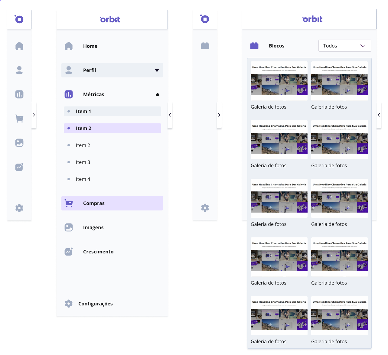
Headers e Tab Menu

Tooltips

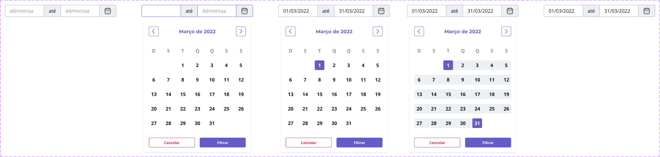
Datepicker
Card

Loader

Guidelines

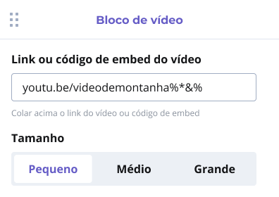
Cards WYSIWYG


Chamaleon 🦎
A base e ordem para a construção foram as mesmas do Andromeda, com o adicional desse grande desafio de fazer algo que além de simples, seja extremamente personalizável, nesse momento, contei por três meses com a ajudado de Daniel Rocha no UI Design.
Espaçamentos 📐
Os espaçamentos foram adaptados à partir das regras do Andromeda, mas adicionamos breakpoints e simplificamos a quantidade de tokens de espaçamento para facilitar a construção dos nossos usuários.

Tipografia ✍️
Após os espaçamentos, separamos a tipografia em família, sentimentos, tamanhos e variações com a oferecer versatilidade à quem quer experimentar e uma sugestão à quem quer ajuda.

Botões 🔘
Os botões tinham que respeitar a máxima de serem personalizáveis mantendo boas práticas de usabilidade como terem seus estados bem definidos independentemente da cor escolhida e mantendo as boas práticas do Marketing Digital, como o botão com texto principal e texto de apoio.

Próximos passos 🐾
Com a crise econômica e o investimento inicial acabando, os cofundadores ficaram receosos de pegar um segundo aporte financeiro, e após uma conversa muito amistosa, o squad se desmanchou e encerramos nossa atuação no Design System. Para próximos passos, finalizar os componentes e as validação nos testes de usabilidade, seguido de uma validação em piloto do produto junto com os componentes criados, incluindo designers especializados em criação de Landing Pages na amostragem para gerarmos, durante o testes, novos templates e reproduzirmos o banco de templates que já existe, e por fim, iniciar o terceiro passo de documentação e regras
Aprendizados 🤓
Trabalhar na construção de um Design System foi muito gratificante do ponto de vista de desenvolvimento na habilidades estratégicas e de gerenciamento de produto. Me reacender o meu gosto por UI e me aprimorar na disciplina e melhorou a minha comunicação de contexto ao fazer um handoff para um desenvolvedor.