


Orbit Pages
Um construtor de páginas sem código e simples para o mercado de Marketing Digital
UX Design • UI Design • Gestão de Produto • Métodos Ágeis
Conteúdo 📖
1. Desafios
2. Objetivos
3. Meu papel
4. Processos
5. Primeiro contato com os usuários
6. Visão de Produto e Working Backwards Roadmap
7. Roadmap de Quatro Quarters
8. Design System
9. Prototipação
10. Validação
11. Iteração
12. Design Sprint
13. Contrutor de Páginas
14. Aprendizados
15. Próximos passos
Desafios 💪
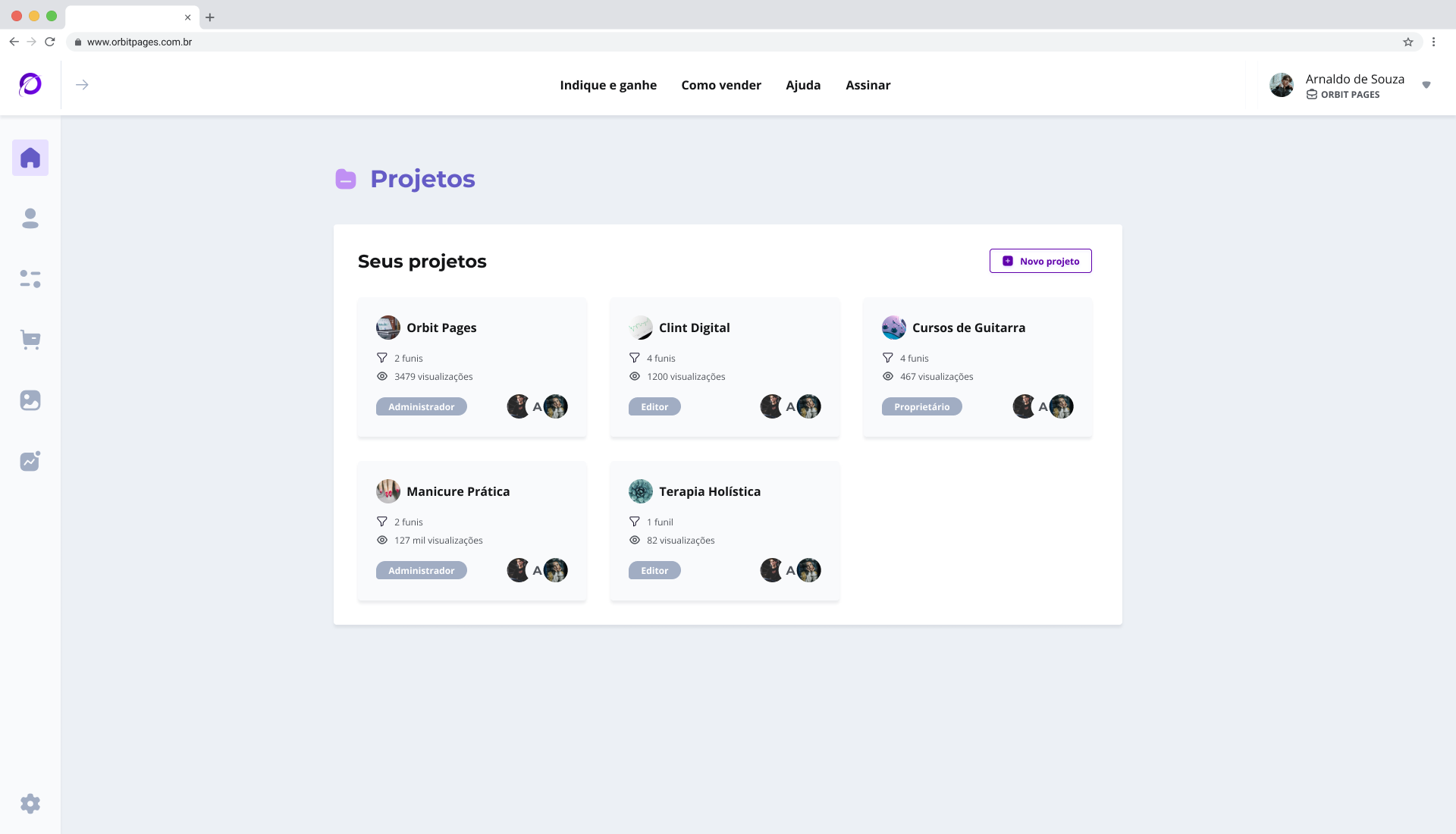
A Orbit Pages é uma pequena startup que recebeu um aporte financeiro para solucionar o problema de escalabilidade causado por limitações de tecnologia e a alta taxa de abandono de novos usuários superior à 60% em seu Construtor de Páginas (Landing Pages) voltado para o Marketing Digital.
Objetivos 🚩
✅ Criar uma nova versão escalável e fácil de usar do Orbit Pages.
✅ Criar um Design System que servirá este e novos produtos.
Meu papel 👨💻
Atuar como Designer de ponta à ponta, atuando com estratégia, pesquisa, descoberta, prototipação e validação sendo responsável por todas as decisões tomadas.
Processos ⚙️
Com um time recém formado, facilitei uma dinâmica de Processo de Trabalho de UX com todos, o intuito foi definir escopo, nivelar expectativas e esclarecer papéis.
O resultado foi a definição de responsáveis, participantes e as etapas de design e o documento ficou acessível a todos do time através do Notion, sendo atualizado sempre que necessário.

Este processo de UX foi utilizando na trilha de discovery do método Ágil Dual-Track, terminando na entrega para os desenvolvedores iniciarem a trilha de delivery, garantindo um ritmo de entregas equilibrado entre o time.
Primeiro contato com os usuários 🤝
Realizei um teste de usabilidade misto com tarefas e questionário, na intenção de validar hipóteses levantadas pelo cofundadores da Orbit, identificar pontos de dor no produto e envolver o time como observadores e tomadores de nota para disseminar cultura de UX.
Como cerca de 98% dos usuários chegavam à Orbit Pages através da plataforma da Eduzz, utilizei o seu documento de Personas da Eduzz e a demografia do Mixpanel, e defini junto do PO o seguinte recorte de amostragem:
• Nível de experiência: Primeira Venda, Iniciante, Intermedíario e Avançado
• Nicho de mercado: Afiliado, Infoprodutor e/ou Agência
• Demografia: Idade, Geografia e Identidade de Gênero
Na sequência, apliquei o teste e consolidei os resultados, e os principais pontos de dor foram:
❌ Fluxo até o construtor de páginas era extenso, gerando um tempo de tarefa muito extenso até a entrega de valor.
❌ Onboarding apenas explicava o que cada item do menu fazia, mas não dava contexto dos benefícios da ferramente, muito menos as pessoas para a conclusão de suas tarefas.
❌ Elementos de inferface com baixa intuitividade prolongando a curva de aprendizado e causando mais acionamentos ao suporte.
💡 Falei um pouco mais de moderação, consolidação dos resultados e iteração em dois outros momentos que houveram testes de usabilidade neste case. Mas todas as etapas aconterceram em todos.
Visão de Produto e Working Backwards Roadmap 🗺
Após adquirir algum conhecimento sobre o produto e seus pontos de dor, sugeri que seria importante para um novo time entender a visão do produto e esclarecer a comunicação de expectativas de longo prazo, portanto facilitei as dinâmicas com todos envolvidos no produto.
Visão de produto

Roadmap Working Backwards

Roadmap de Quatro Quarters 🗺
Após esclarecer as visões de longo prazo, sentimos a necessidade de tangfacilitei a dinâmica de quebra do primeiro trimestre do Roadmap para visualizar objetivos a médio prazo e gerar tarefas para todas as disciplinas. Primeiro definimos os objetivos e depois quebramos isso em ações a serem realizadas por cada papel dos participantes e elencados por prioridade novamente.

Design System 🧰
Como consistência, usabilidade, acessibilidade e escalabilidade eram objetivos, iniciamos a criação de um Design System para a nova versão. Se você quiser saber mais, é só acessar o case do Orbit Design System (pode clicar, vai abrir em outra aba).
O Design System foi separado em dois níveis, Andromeda, que comportaria toda a interface e elementos de interação da plataforma Orbit Pages, e Chamaleon, que se encarregaria de ser algo extensamente adaptável para poder gerar os mais variados sites construídos por nossos usuários, e iniciamos a construção pelo Andromeda, por conta da priorização do roadmap e da flexibilidade de poder pilotar e lançar a nova versão parcialmente se preciso.
Prototipação 👨🎨
Iniciei a prototipação do fluxo até o editor, como o restante do time de desenvolvimento não estava disponível no momento por conta de tarefas relacionadas à migração dos servidores sendo priorizadas. Realizei a ideação do fluxo em dupla com o Product Owner utilizando descobertas do primeiro teste de usabilidade, uma análise quantitativa com um funil de conversão de novos usuários e benchmarking. Partimos direto para a prototipação em alta fidelidade pois estávamos validando os novos componentes do Design System também.


Validação 🕵️♂️
O teste foi aplicado com tarefas do fluxo utilizando um protótipo navegável, participei de moderador e convidei mais duas pessoas do time para participarem como observadores e tomarem nota (lembra que eu falei que havia esse e mais um exemplo de teste neste case? Mostro mais sobre as anotações de descobertas que utilizei já já).
Iteração 🔧
Por fim, consolidei todas as descobertas em gráficos e destaquei as principais descobertas para realizar uma dinâmica de ideação com todo o time para apresentar os resultados e gerar hipóteses e ideias sob os aprendizados. Com isso ganhamos agilidade e reduzimos o risco de algum viés.
Recorte dos gráficos apresentados em dinâmica para dar contexto aos participantes:

Recorte dos insights descobertos por cenário do fluxo, onde comentamos pontos positivos, de atenção e negativos em pontos específicos do fluxo com base nas descobertas:

Por fim, concluímos que o teste foi um sucesso e assumimos em time o risco de não realizar uma nova validação nas alterações por conta do pouco tempo e do resultado positivo.
Design Sprint: Construtor de Páginas 🦄
Com o fluxo até construtor na esteira de desenvolvimento, chegou a hora de iniciarmos o processo de descoberta da interface do Construtor de Páginas, com o time mais maduro e aderido ao processo de Design, sugeri em um dos nossos encontros remotos realizarmos uma Design Sprint e expliquei brevemente do que se tratava com ênfase na rapidez da entrega dos resultados, já que tempo era um dos nossos maiores desafios. O time se mostrou muito receptivo, portanto, iniciei o planejamento.

Planejamento
A minha primeira ação ao planejar estar Design Sprint foi identificar os key users (usuários chave) da metodologia e os participantes do teste de usabilidade, já que teríamos apenas sete dias até a realização das dinâmicas. Identifiquei os participantes e contei com a ajudar de um dos cofundadores, que por ora vestia chapéu de Product Owner para entrar em contato com as pessoas. Em seguida, revisitei o livro Sprint e busquei referências de como aplicar Design Sprints remotas, ultilizamos o Miro como ferramenta de quadro branco, com o template do próprio Jake Knapp, um dos autores do livro citado acima, adaptado para a nossa realidade, o Zoom como plataforma de videoconferência e o Notion para toda a documentação.

Documentação da Design SprintPor fim, defini o cronograma de atividades, revisei com o time e compartilhei com os participantes junto com um contexto do que e porque iríamos realizar.

Cronograma da Design SprintExecução
Iniciamos com as apresentações e uma dinâmica de quebra-gelo para gerar familiaridade e incentivar o conforto de todos para se expressarem. Em seguida, as Lightining Talks (Conversas relâmpago), em que os co-fundadores apresentaram um pouco mais do contexto e visão de futuro da marca para o construtor garantiram que todos estivessem na mesma página sobre os objetivos esperados. À seguir, levantamos hipóteses com a dinâmica de How Might We (Como podemos…?) para levantar pontos de dúvida para alimentar nossa discussão, elencaram as dúvidas mais relevantes e associaram as semelhantes em grupos. Na sequência, três usuários liderraram um time cada no desenvolvimento de um Mapeamento da Jornada do Usuário, os participantes votaram na melhor descrição de jornada, que foi iterada com ajuda de todos, na sequência, elecantamos pontos positivos e negativos de cada etapa da jornada, e para encerrar o Mapeamento, associamos as dúvidas geradas no How Might We ao ponto expecífico da jornada em que mais era aplicável.
Uma pausa para o almoço e iniciamos a tarde discutindo objetivos e elencando os três principais pontos de dor na visão do grupo para as três rodadas de Crazy Eights, e as dores elencadas foram:
❌ Construtor não se adapta às necessidade específicas das personas
❌ Visual das páginas no celular não causam Efeito “UAU”
❌ Interação com o construtor limita por ser muito trabalhosa
Iniciei uma votação para decidir o maior ponto de dor, o construtor não se adapta às necessidades específicas das personas recebeu a maoria dos votos.
Partimos novamente para o lápis e papel desenhar os esboços mais detalhados do onboarding.
Quando finalizados, os esboços receberam as dinâmicas de Heat Map (mapa de calor), Speed Critique (críticas rápidas), Straw Poll (enquete) e por a Super Decision (super decisão), para identificar os dois melhores esboços, que foram para a votação e o vencedor foi escolhido por conta dos seguintes pontos positivos:
✅ Interação específica por nicho de usuário.
✅ Edição de componentes WYSIWYG (What You See is What You Get)
✅ Pré-visualização de modelos de página


Userflow
Com base no esboço e em benchmarking, construímos um userflow para guiar nossa prototipação.

Protótipo
Para agilizar ao máximo, executamos o protótipo usando a biblioteca de componentes que já tínhamos e adaptamos apenas o necessário para a validação.


A máxima era manter as escolhas de design e tecnologia o mais simplificadas o possível, ajudando a traduzir a identidade da marca ou produto dos nossos usuários como um guia para que as pessoas pudessem focar em suas vendas e não em detalhes técnicos de tecnologia e design, podendo escolher o melhor jeito de construir sua página de acordo com o seu perfil de uso do produto. Podendo aceitar:
• Uma sugestão de página gerada com base nas cores, logotipo, fonte e estilo da marca
• Utilizar uma biblioteca de templates curados por referências em Design de Landing Pages e Marketing Digital e adaptá-los à necessidade
• Começar do zero
Validação
A validação ocorreu no terceiro e último dia da dinâmica, realizamos testes de usabilidade em três usuários seguindo o mesmo recorte de amostragem.

A validação ocorreu no terceiro e último dia da dinâmica, realizamos testes de usabilidade em três usuários seguindo o mesmo recorte de amostragem de todos os testes que realizei na Orbit.
Adaptei a excelente Tabela de Tabulação da Sheylla Lima, que nos possibilitou agir com agilidade, manipular dados com facilidade e garantir consistência em todas as tabulações e consolidados realizados.
Tabulação

Descobertas
O teste mais teve mais de 70% de aceitação em percepção de valor e affordance (intuitividade/usabilidade) e com base nisso consideramos a validação um sucesso, além disso, fizemos várias descobertas valiosas.
❌ Nenhum perfil de usuário optou por construir a página do zero
❌ Linhas guia de cores diferentes confundiram
❌ O nome Construtor ficou muito parecido com Construtor Interligente e não ficou intuitivo que eram o Templates
❌ O termo definir domínio do jeito que foi exposto não foi entendido pelo nível iniciante
✅ Edição de componentes WYSIWYG com feedback instantâneo foi um acerto
✅ É importante conseguir reorganizar os blocos com facilidade
Com isso, consideramos a Design Sprint um sucesso e atualizamos o userflow de acordo com o que havíamos aprendido.
Userflow atualizado

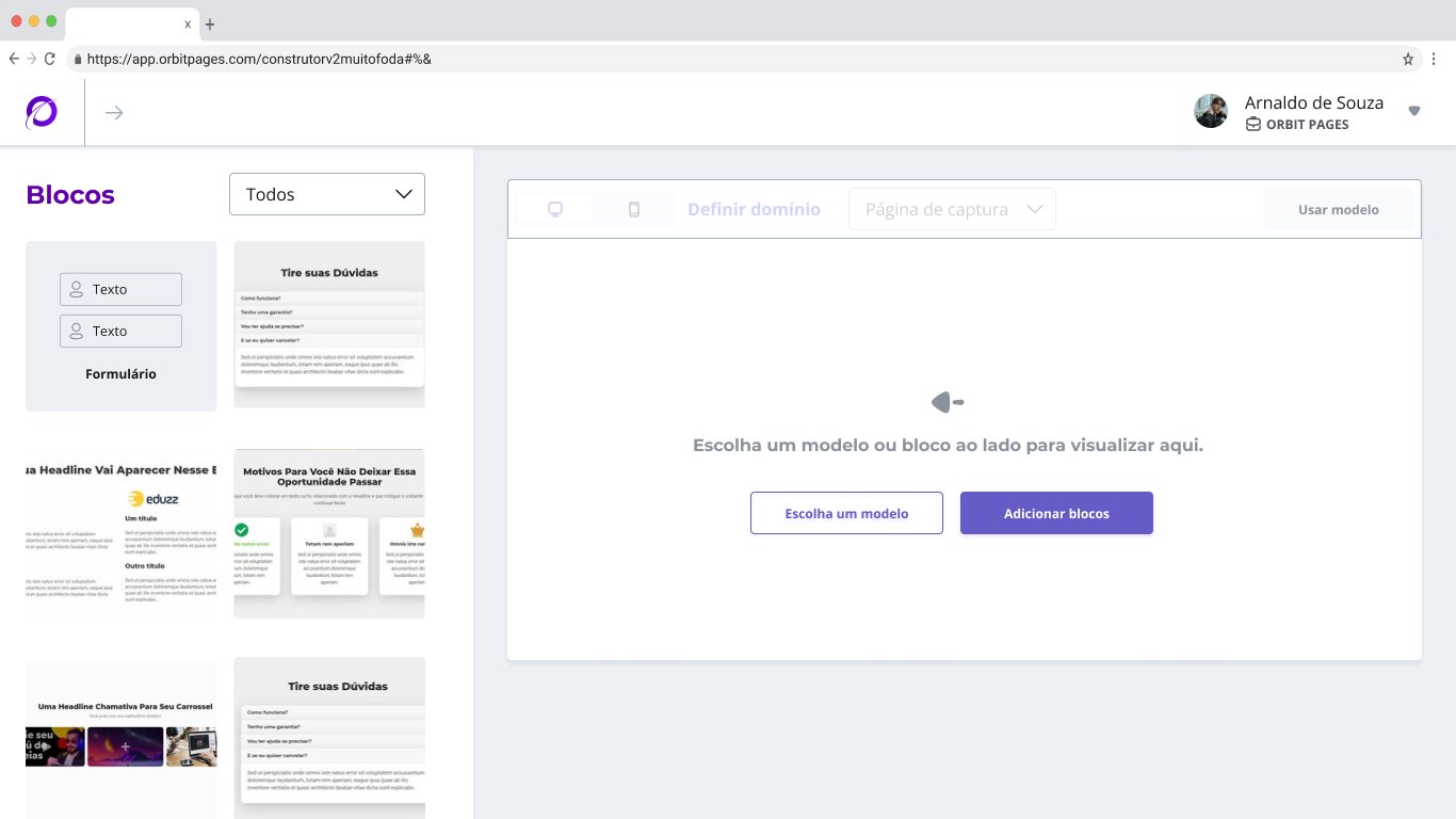
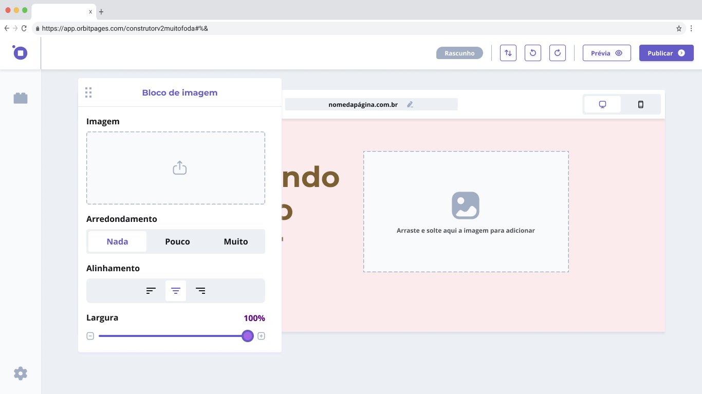
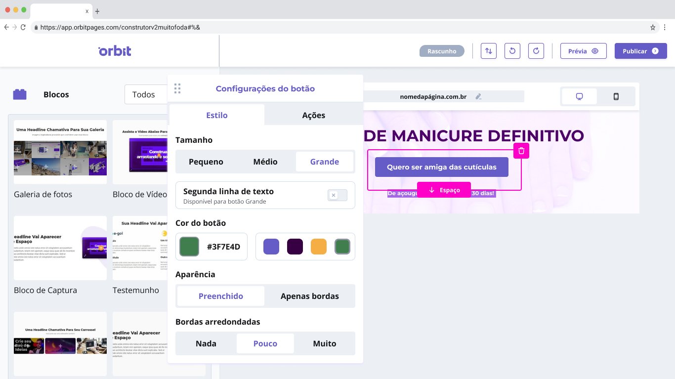
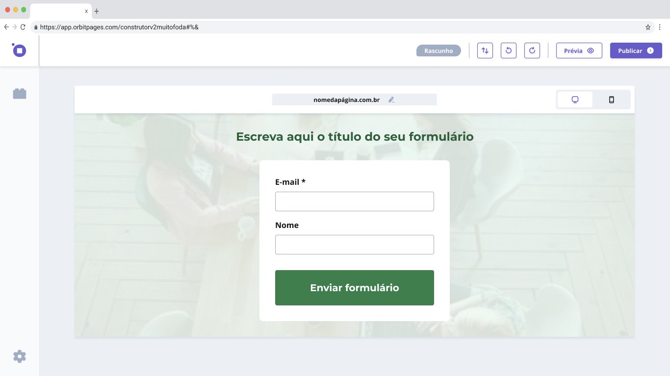
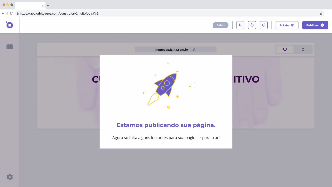
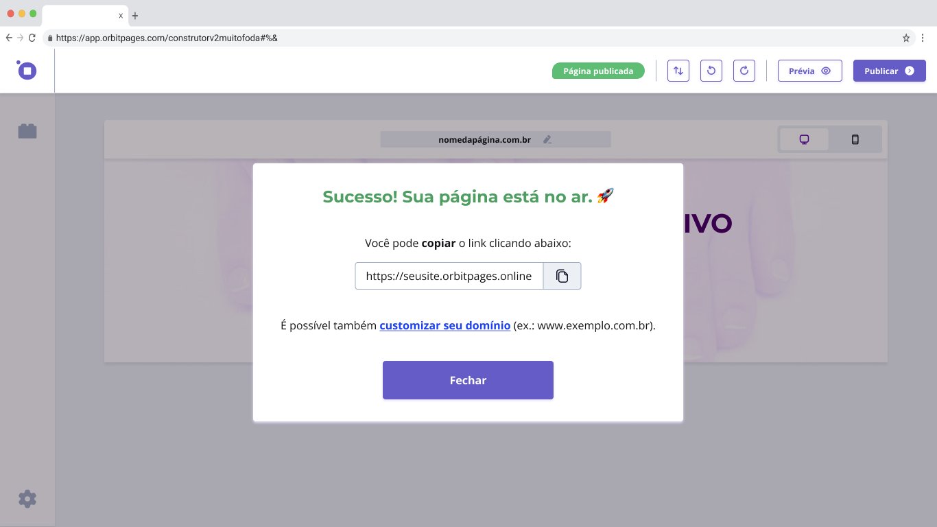
Construtor de Páginas 👷♂️📄
Iniciamos o 2º tier do Design System, o Chamaleaon, e quando os building blocks estavam prontos, a construção do novo construtor em alta fidelidade em paralelo com os seus novos componentes, a prototipagem foi separada por features e quando acumulávamos um conjunto de features, realizávamos uma validação com um teste de usabilidade. A galeria abaixo mostra alguns resultados.

Aprendizados 🤓
O grande aprendizado da minha passagem na Orbit foi apreciar o universo das startups, poder atuar em um novo produto que está para nascer e ser responsável por todas as decisões de Design trazem consigo um senso de responsabilidade muito gratificante, poder formentar, aplicar e amadurecer processos em um time com a entrega de valor em vista.
Próximos passos 🐾
Com a crise econômica e o investimento inicial acabando, os cofundadores ficaram receosos de pegar um segundo aporte financeiro, e após uma conversa muito amistosa, o squad se desmanchou e encerramos nossa jornada com a certeza de que nosso trabalho pode mudar a vida de pessoas que estão buscando se restabelecer financeiramente, uma nova carreira ou acrescentar praticidade à sua rotina de trabalho e fazer eles sentirem, que sim, conseguem fazer sua própria Landing Page.
Para próximos passos, finalizar o restante Construtor, possibilitando um lançamento de um piloto para Key Users, colhendo todos os feedbacks de observações naturalistas e acompanhando métricas-chave para o produto, para enfim fazer um plano de lançamento da nova versão do Orbit Pages.